
Showing posts with label BRIEF 3. Show all posts
Showing posts with label BRIEF 3. Show all posts
Sunday, 26 May 2013
Brief 3:: Thanks pages
I have been working on the final pages for Liv's lookbook where the acknowledgements are being made. I want this design to remain simple and minimal like the rest of the publication. I have tried putting the garment information and the acknowledgements on the same page but i think it is going to work better if they are on separate pages so that the page looks cleaner.
Saturday, 25 May 2013
Friday, 24 May 2013
Brief 3:: Billboard mock-up
I have considered Liv's advertising on a larger scale so attempted to mock up a billboard showcasing her collection. However, in doing this I realised that I didn't feel a billboard was fitting with her collection as it was too rustic and shabby. Consequently, I decided against this.


Thursday, 23 May 2013
BRIEF 3:: Exhibition Space
We have today put up the lettering into Liv's exhibition space. We purposely painted the lettering white to look like an embossing on the wall. I think it has worked really well and we are both pleased.
Liv is going to put a white floating shelf in the space and three white frames to exhibit her work.


Liv is going to put a white floating shelf in the space and three white frames to exhibit her work.


Brief 3::Images
I have been working with placeholder images for the past few weeks but I have finally managed to get a few preliminary images from Liv. These are not the final images that she wants to use but I am going to use them for now and will then alter the images once she attains her final imagery.
I have begun to play around with lookbook designs and press releases using this new imagery.
I have begun to play around with lookbook designs and press releases using this new imagery.
Wednesday, 22 May 2013
Brief 3:: Letterhead
I have designed a letterhead for Liv to use so that she contact professionals and use it as a company brand if she wishes.
Brief 3:: Information Postcard
I have been playing around with how best to present the information on the past postcard..


Tuesday, 21 May 2013


Brief 3:: Store bag
I want to propose what the store bags could look like. I have researched into existing high end fashion store bags and it seems that luxe paper/card bags are used.


In addition to this I have found that Harrods have branded bags which are re-usable. This is the case with a few stores, even those on the high street. So this is something I could look at producing.


.jpg)


In addition to this I have found that Harrods have branded bags which are re-usable. This is the case with a few stores, even those on the high street. So this is something I could look at producing.


.jpg)
Brief 3:: Press Release
After looking at a few fashion magazines I have produced a press release for Liv. Again, I have had to use placeholder images as I still haven't received the images from Liv.
When I get these images I will place them in to see which layout design will work best.
Brief 3:: Vogue magazine ad
I have been looking at the Vogue magazine ads to see how designers normally advertise their collections. It seems to be that these high end designers use full bleed images to make a high impact and then position the brand logo onto the page too.
Brief 3:: Exhibition Space

Liv showed me her exhibition space so I know what space I have to work with. We are going to fix the lettering the afternoon or tomorrow.
Brief 3:: Swing Ticket
I have been with Liv this morning trying to eyelets in the swing tickets. After much trial and error, we have found that hole punching the swing ticket and then fixing the eyelet in was an easy way to ensure the paper didn't crease and that the hole was in the same place each time.


Liv bought some ribbon to put through and then safety pin onto the garments. After talking to my peers, I feel the ribbon has too much of a satin shine to it. Therefore, I am going have a look for some white twined string.
We also want white eyelets, so I have been looking for them on the internet. They seem hard to come by so I am going to spray paint a couple of the silver ones to see how that works.
Monday, 20 May 2013
Brief 3:: Presentation Folder
I have considering how I am going to present the print collateral for this brief as a package so have created this presentation folder. I have branded the presentation folder to fit in with the other collateral. I mocked up the design on a smaller scale to check it would work and have then printed it downstairs with James on GFSmith Colorplan Ice White.


I am thinking that I may even slot one of Liv business cards into the front cover so that the embossing is evident from the offset.
Sunday, 19 May 2013
Brief 3:: Envelopes
I have received the envelope samples and have printed Liv's logo onto the envelope to see what it will look like. I need to add 'Spring/Summer 2014' beneath the logo but the concept is there.


I then placed the postcard lookbook into the envelope. In doing this I realised that I will not need to have a cover postcard as the envelope essentially does this.


I then placed the postcard lookbook into the envelope. In doing this I realised that I will not need to have a cover postcard as the envelope essentially does this.


Saturday, 18 May 2013
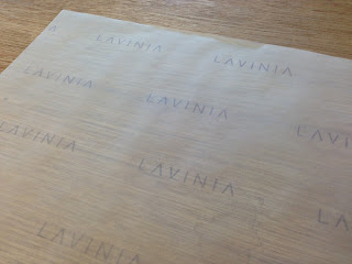
Brief 3:: Clothing wrap
I have made a tiled pattern of Liv's logo which I am then going to print onto tissue paper to be used as wrapping for when purchases are made either in-store or online. I have used the colour of her branding, it may look a little washed out on the translucent paper but it should look professional once clothes are wrapped in it.


Brief 3:: Envelope Samples
I have ordered samples of C5 translucent envelopes as I feel these could work considerably well with our theme of panopticism. We'll see..


Subscribe to:
Posts (Atom)