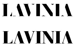
As Liv and myself had decided on a typeface and a concept in order to attempt to tie her design practice and the branding in together, I began working on the type....
I decided this wasn't really working as it looked too much like a stencil. It was also too bold and did not reflect the expensive and high quality fabrics Liv is going to be using in her collection. As a result, I decided to look at removing different parts of the type structure so that the finer elements are left in tact....
Nevertheless, I still felt that visually this wasn't working as it is far too heavy and bold looking. So I am going to try with a different typeface to see if it visually works better.


